Role • Team • Timeline
Senior Product Designer • Two Designers • 9 months
Problem: How can we instruct users clearly and simply to capture the photos our AI needs to build an accurate 3D model of a home?
Hosta A.I. is an A.I.-powered picture to 3D model app solution that builds 3-dimensional models of rooms and homes. The app as it was struggling to coach users through the process of capturing the images necessary to build accurate 3-dimensional models, reaching only about a 20-30% success rate. Working with another designer, we iterated on the capture flow for users to be able to take the least amount of photos in the simplest way possible in order to create accurate floor plans and 3D models.
We explored the pain points of the current design. How could we balance copy and visual cues to communicate seemingly hyper-specific guidelines?
Challenges:
⏰ ASAP
🏜️ No existing design library
🛜 Browser only
☎️ Old iPhones
👴🏼 Non-tech savvy demographic
🕸️ Complex regulations per state/company
Success Metrics:
✔️ Flow completion
✅ Submission success
🏇🏻 Speed of experience
🔄 Recapture success
🎤 Adjuster Qualitative Feedback
💰 Insurance company buy-in
I worked collaboratively with the other designer to tackle each step of the design process leveraging competitive analyses and existing user data, designing in tandem and cross referencing wireframes, user flows, low and high fidelity designs, notes, thoughts, and problems along the way. We experimented with animation as a solution for the clunky and multi-step directions from the old experience.
The stakeholders insisted the first area to focus on was Recapture - the experience after users had already failed once (a bandaid on a bigger problem). 🤔
We identified where users were failing to understand the needs of the system, and ideated on ways to communicate more clearly. We found the major misunderstandings happened if rooms were not standard, so we created a forked path for users to choose their unique situation, and guided them through custom instructions. We iterated to simplify the icons as much as possible while still being identifiable and consistent with the rest of the experience.

Ideas for room type icons

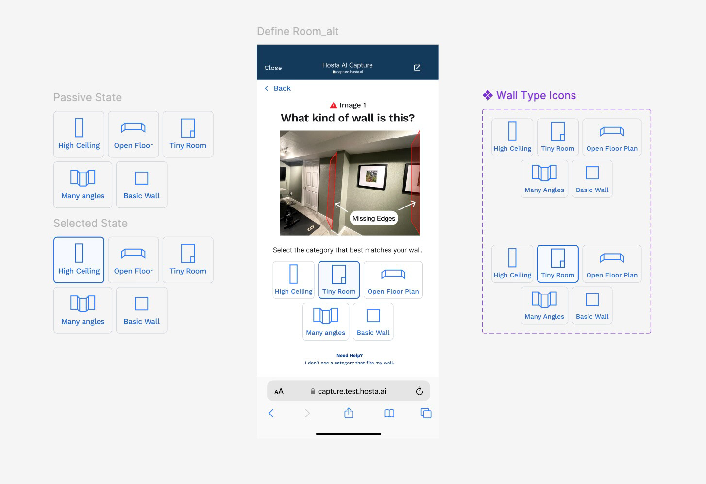
Simplified icons for room types

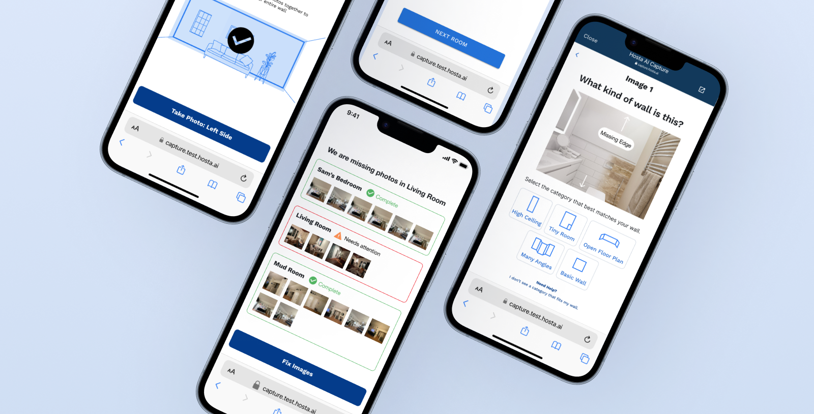
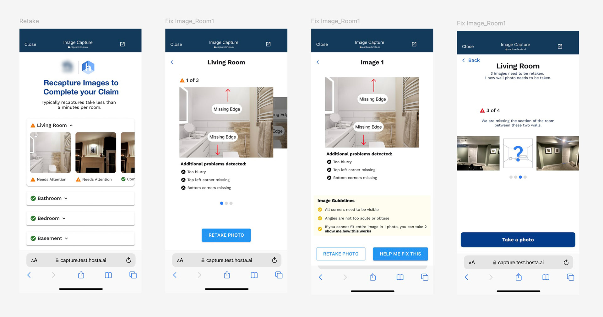
Ideating on how users would navigate recapturing rooms that had failed because they were either missing edges in the images or missing entire walls.

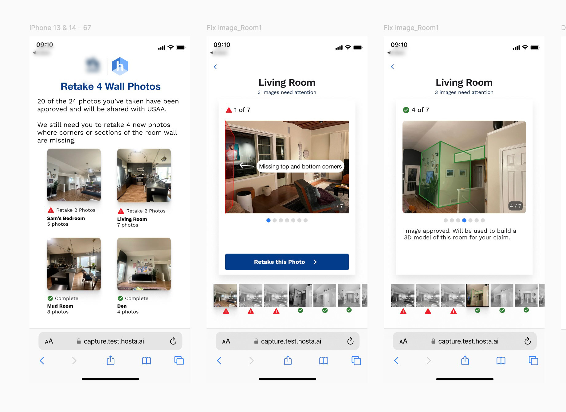
Alternative designs for users in the recapture experience.

Soon it became clear this was a bandaid. We put it on the back-burner, and went to the source: 
the main capture flow.
We ran a competitive analysis, mapped out the pain points of the current experience, and identified the limitations of the current A.I. powered tools that built models from photos. With both design and engineering working toward solutions for making a simpler experience, we redesigned the flow with more clarity and fewer screens. We simultaneously leaned on our A.I. and engineering team to explore technology and other A.I. capability to gain more flexibility in the photos that were usable.

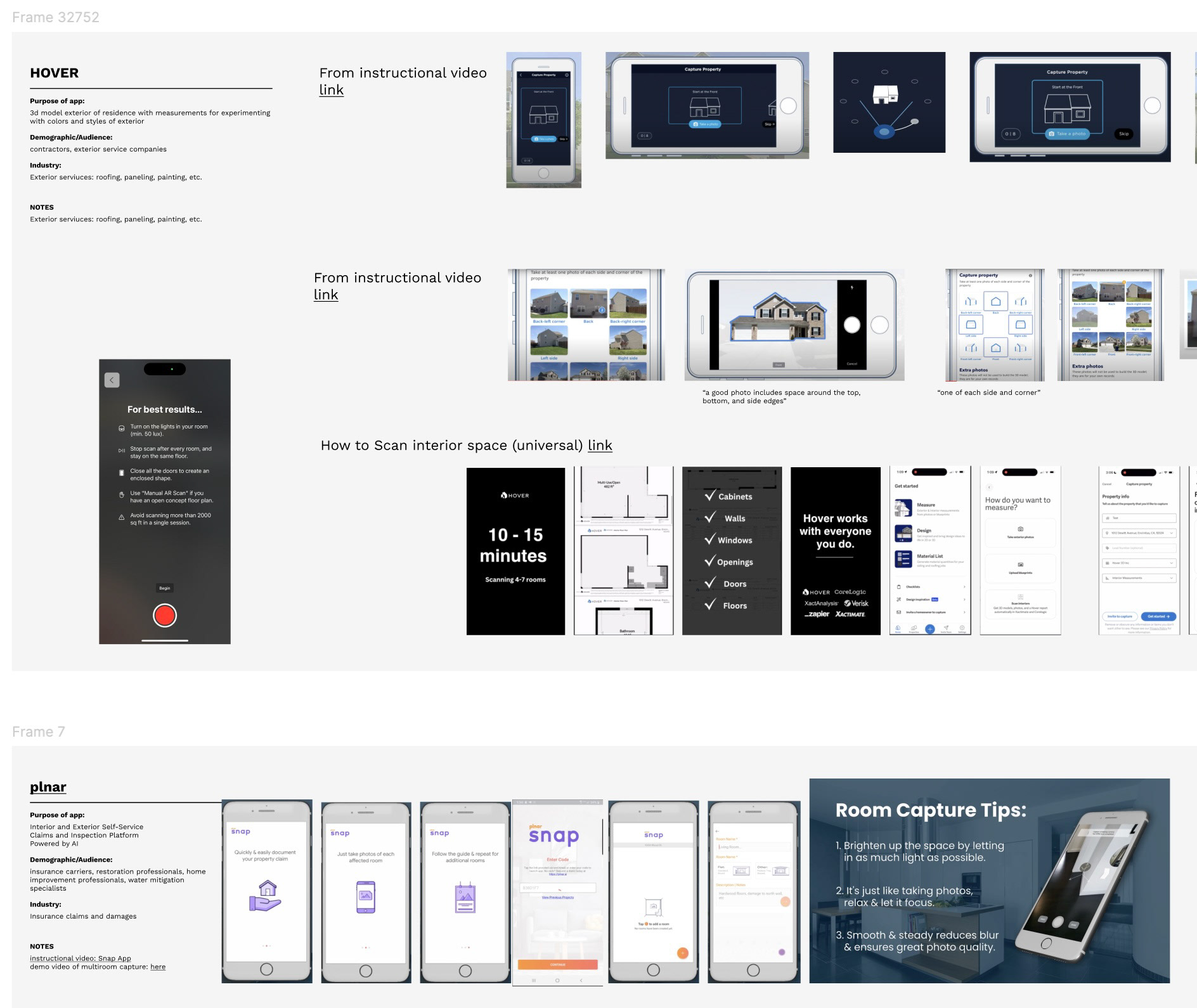
Competitive Analysis reviewing companies with similar capabilities.

It seemed animation was used in all competitive apps, so we began ideating how we could incorporate more.
We introduced users to animations communicating how to move around the space and take photos in order to achieve the type of photos our tech needed to create the 3D model. 

We used simple, blueprint style animations to onboard users with tips on how to succeed before they entered the photo capture step. This replaced the six static images attempting to do the same.

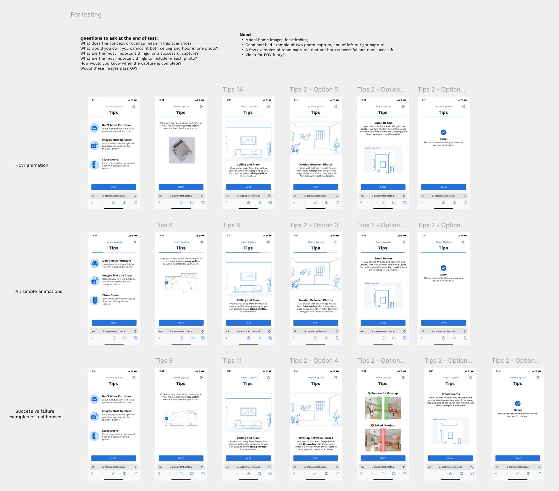
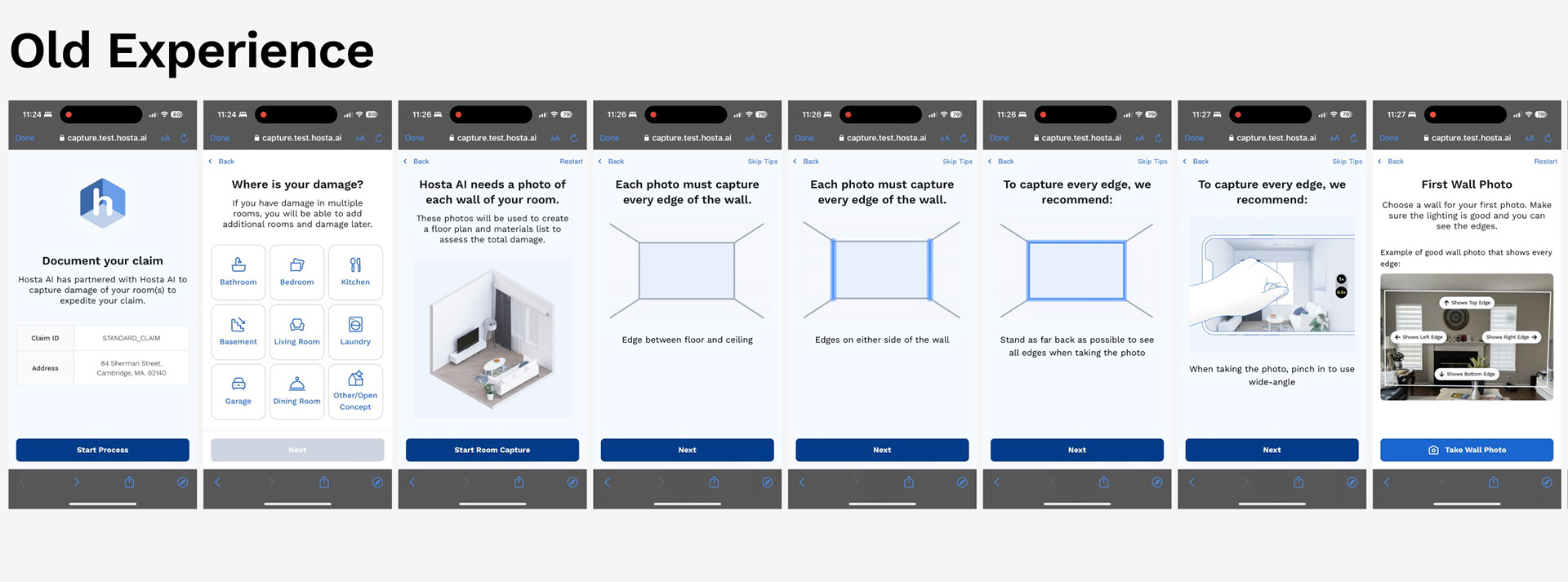
We tested different types of animation and different static screens to see what got the point across the most clearly with the least amount of screens and mental load.

I designed animations as we reworked the photo capture flow to help users understand exactly how and why we needed photos, which ended up reducing the number of onboarding screens by around 50%.​​​​​​​​​​​​​​

As our AI tech evolved, the flow became easier because the flexibility of stitching images together increased on the back end. This dictated the animations I created.

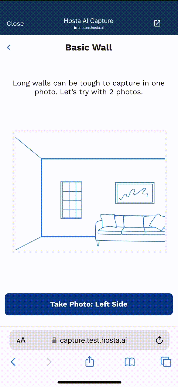
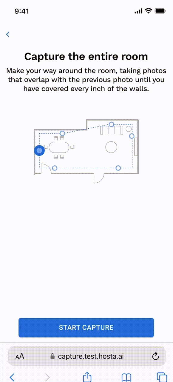
The animation to explain how to capture a wall successfully.

We ran user testing and interviews through Useberry to deduce what types of spaces and walls were causing the most photo capture failures. We grouped our findings into five main wall types: Basic walls, many angles, high ceiling, tiny room, and open floor plan. 

I created animations for each of these to help convey exactly how to capture these walls in order to achieve success on Hosta AI's platform.

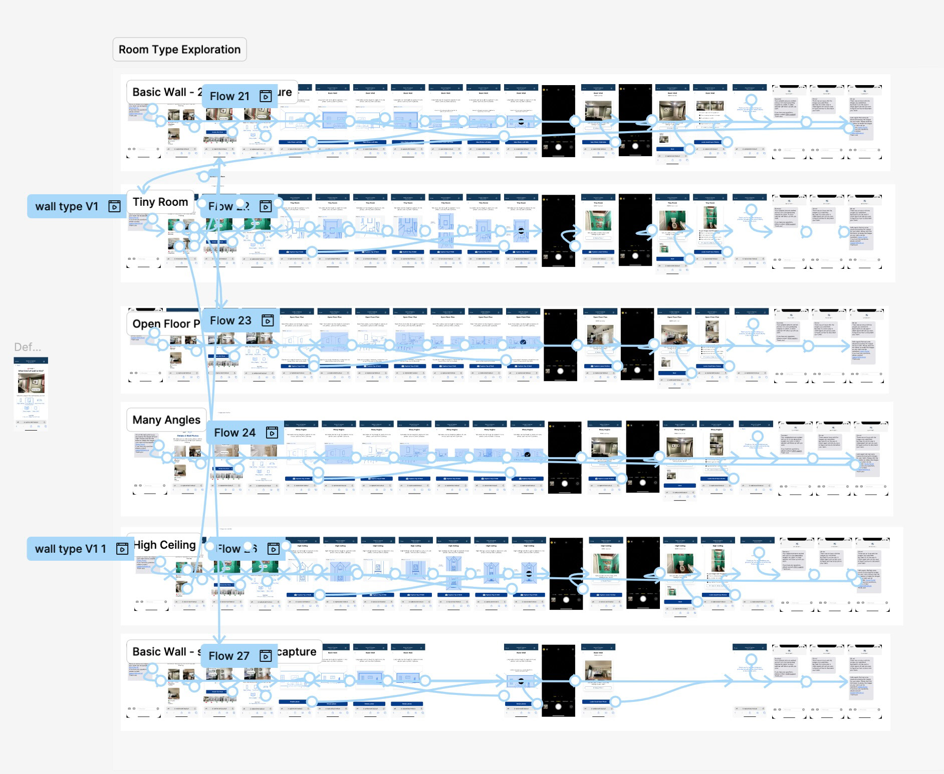
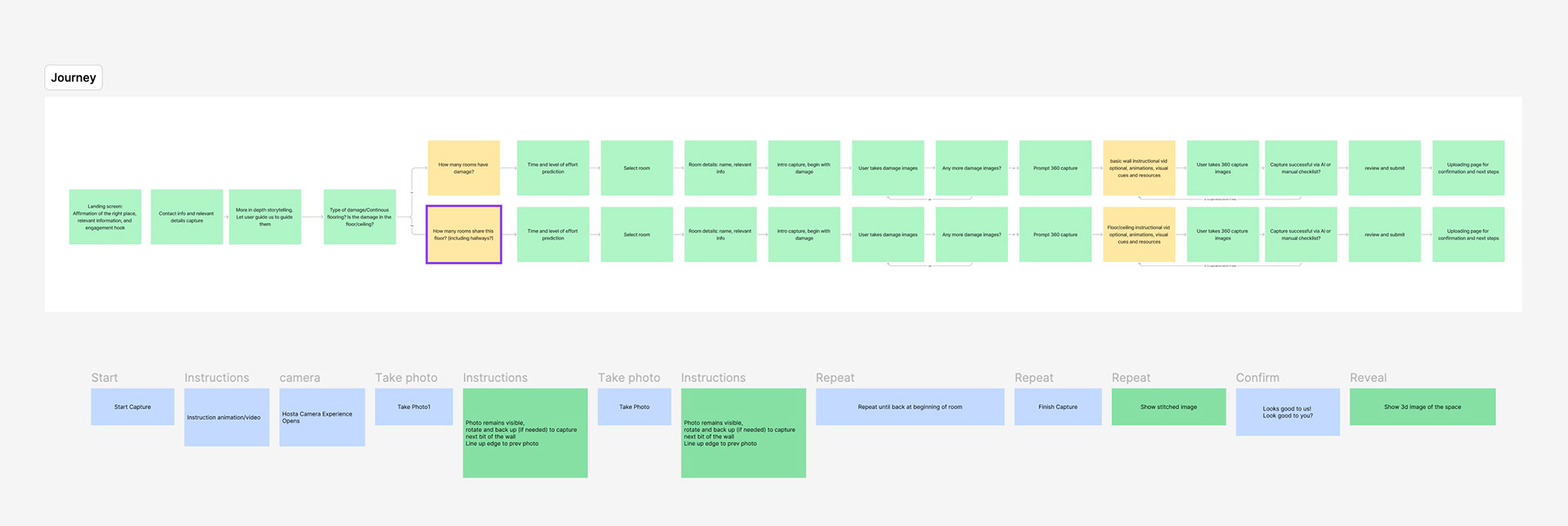
The flow for each different type of room, used for live tested prototypes shared with users and stakeholders.

Upon testing these new designs with animations and clearer language, along with progress on technology that upgraded our A.I. capability, it became clear that we could further simplify the process. By leveraging AI tech within that actual camera feature while the user captured the photos, the need for recapturing failed images drastically decreased.
After testing the old experience with users versus the new experience, our success rate skyrocketed from around 21% to a 70% success rate.
Meanwhile internally...
Our team of engineers and image QA needed a tool to be able to quickly process images and find gaps or mistakes so we could alert the user ASAP if we needed more images.

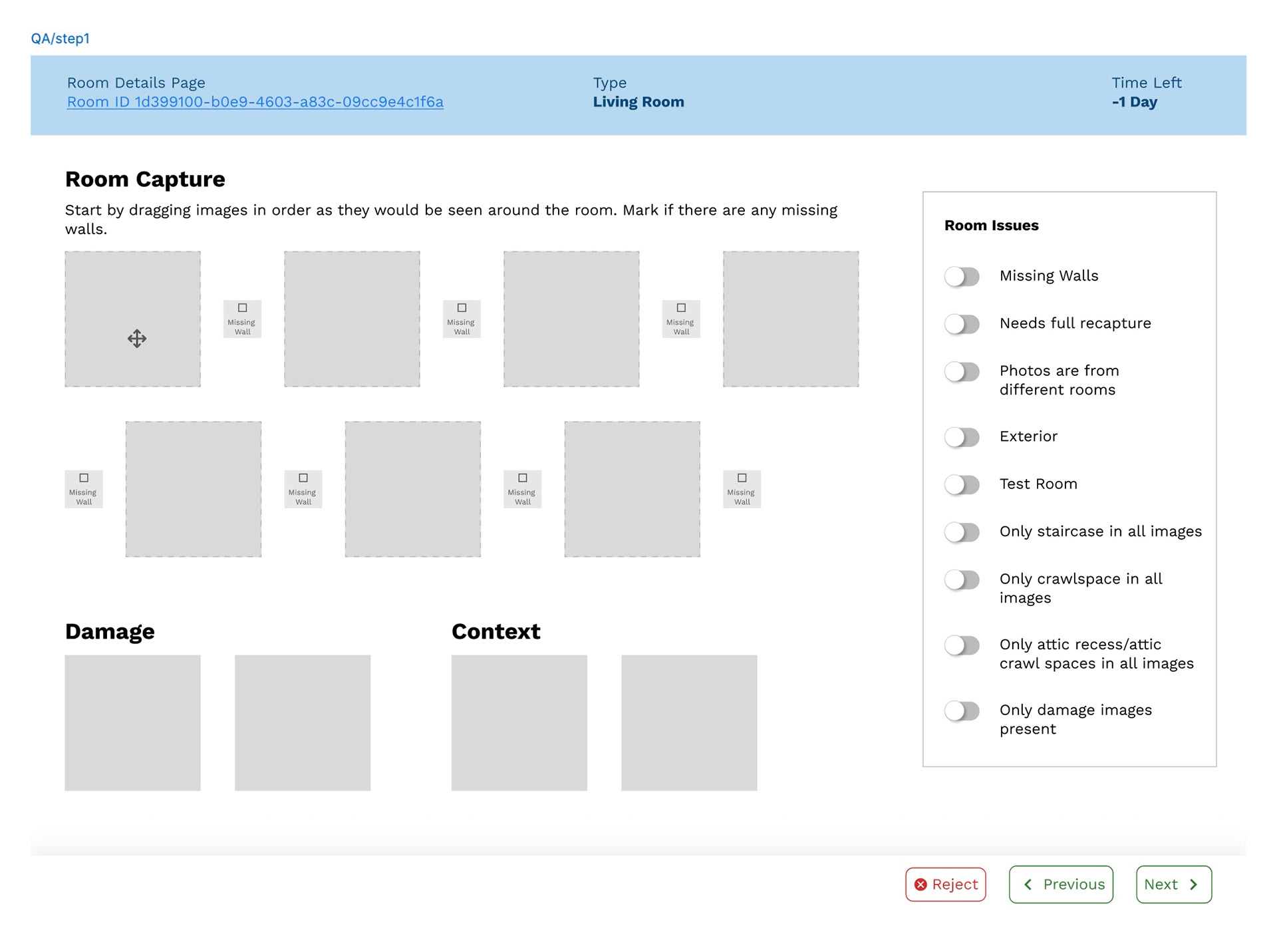
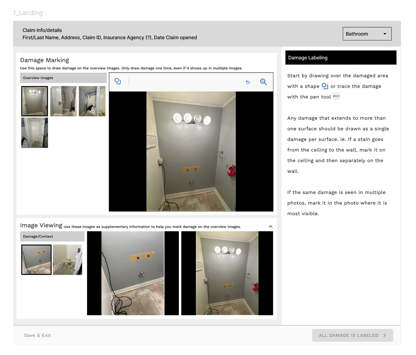
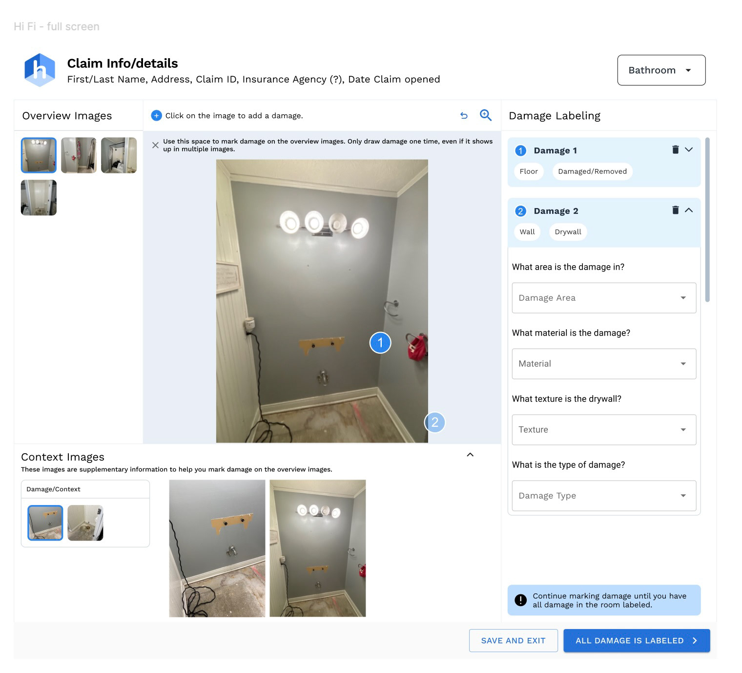
We designed a user friendly tool for our QA team to  process users' submissions.

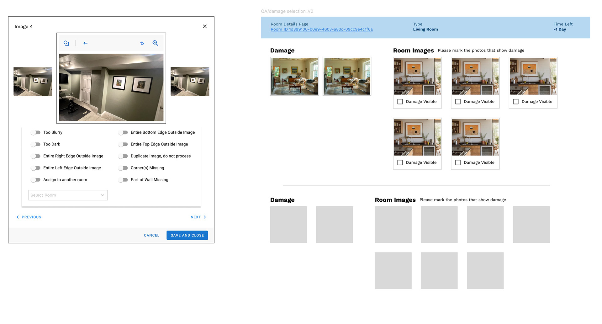
A functional internal tool for QA and engineering

We balanced effort level and user needs to create a baseline functional tool in two weeks that allowed a more comprehensive and faster way to process the user submissions speeding up internal process.
Insurance companies then requested a tool for their adjusters to process the images, narrowing our target demographic to a very specific persona with industry knowledge. We designed out a similarly baseline tool with slightly more visual design to pair with Hosta's main mobile product.
Between the updated capture experience and the internal tools we designed, we helped Hosta land contracts with several major insurance companies and streamlined internal teams to increase the speed of turnaround for user submissions.
Back to Top