
Role • Team • Timeline
Lead UI Designer • One Designer, one Front-End Engineer, & Education Service Manager • One month
Problem: We have the content, we have the audience, but we lack knowledge.
TrainingPeaks University is an in depth education program created for endurance coaches in order to achieve accreditation and recognition in the endurance sports industry. The previous platform hosting our education center was rigid, limited, and lacked basic tracking functionality - meaning we were mostly in the dark with how users interacted with and consumed the content. We needed a platform and design that allowed a seamless integration with our ecosystem of products and also facilitated tracking of course traffic and commerce.
I spearheaded a complete redesign of the site. Working in conjunction with our front-end engineer and the head of the education services, we designed the site and content to cater to the needs of the coaches, making for a much friendlier user experience as well as a much more efficient and informative back end for internal data collection and maintenance.
Challenges:
⏰ Limited time
🫡 Small team
⛔️ Skilljar = VERY constrained
❌ No design resources post
🧐 No previous relevant user research
Success Metrics:
🚗 Traffic
➕ New Users
📈 Registration
📋 Data tracking
✅ Compliance
🤓 Non-Designer Maintenance
📱 Responsiveness
Because the site is built on the platform Skilljar, we needed to work around somewhat extreme limitations of the site's code and design customization capability.
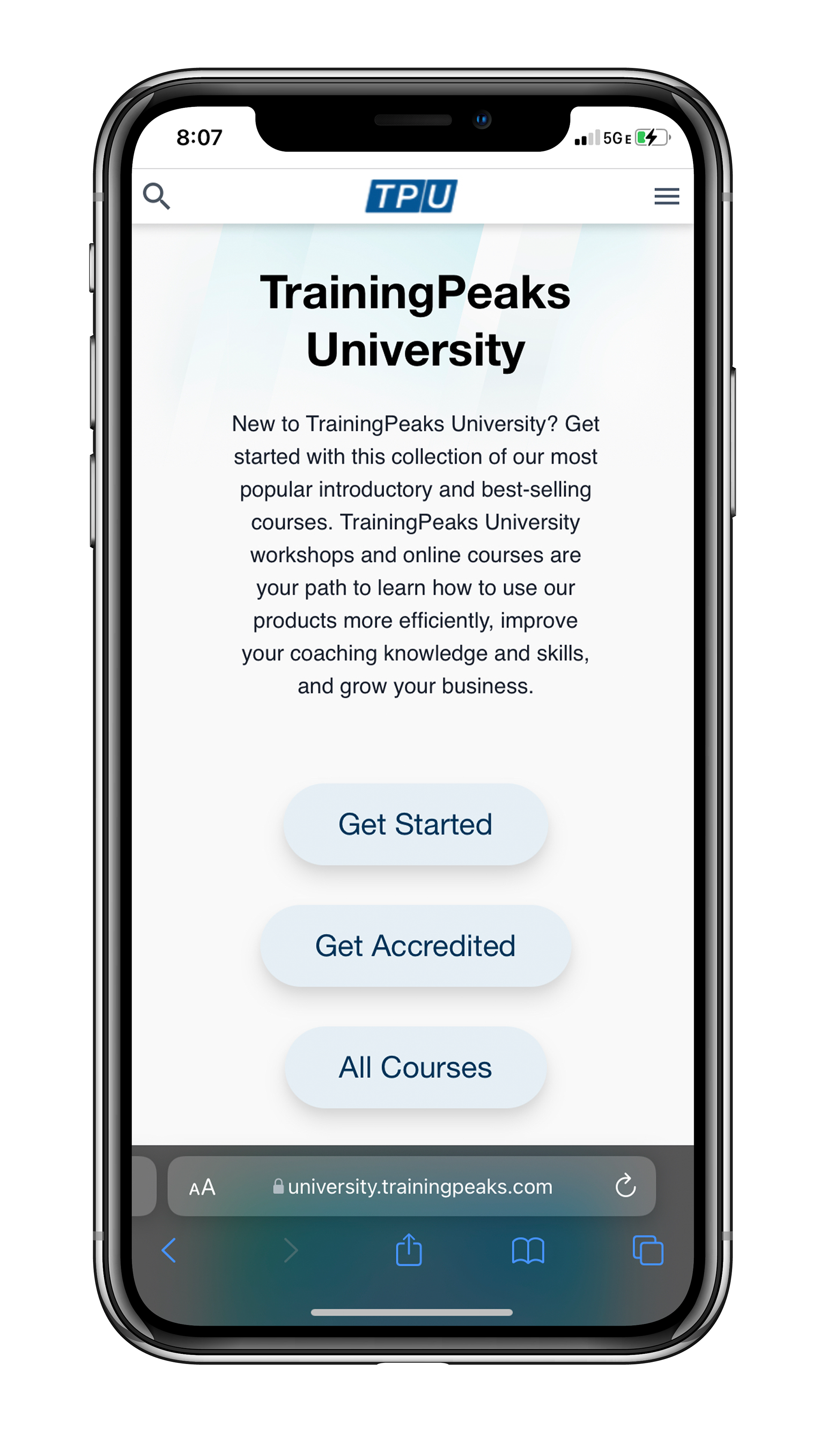
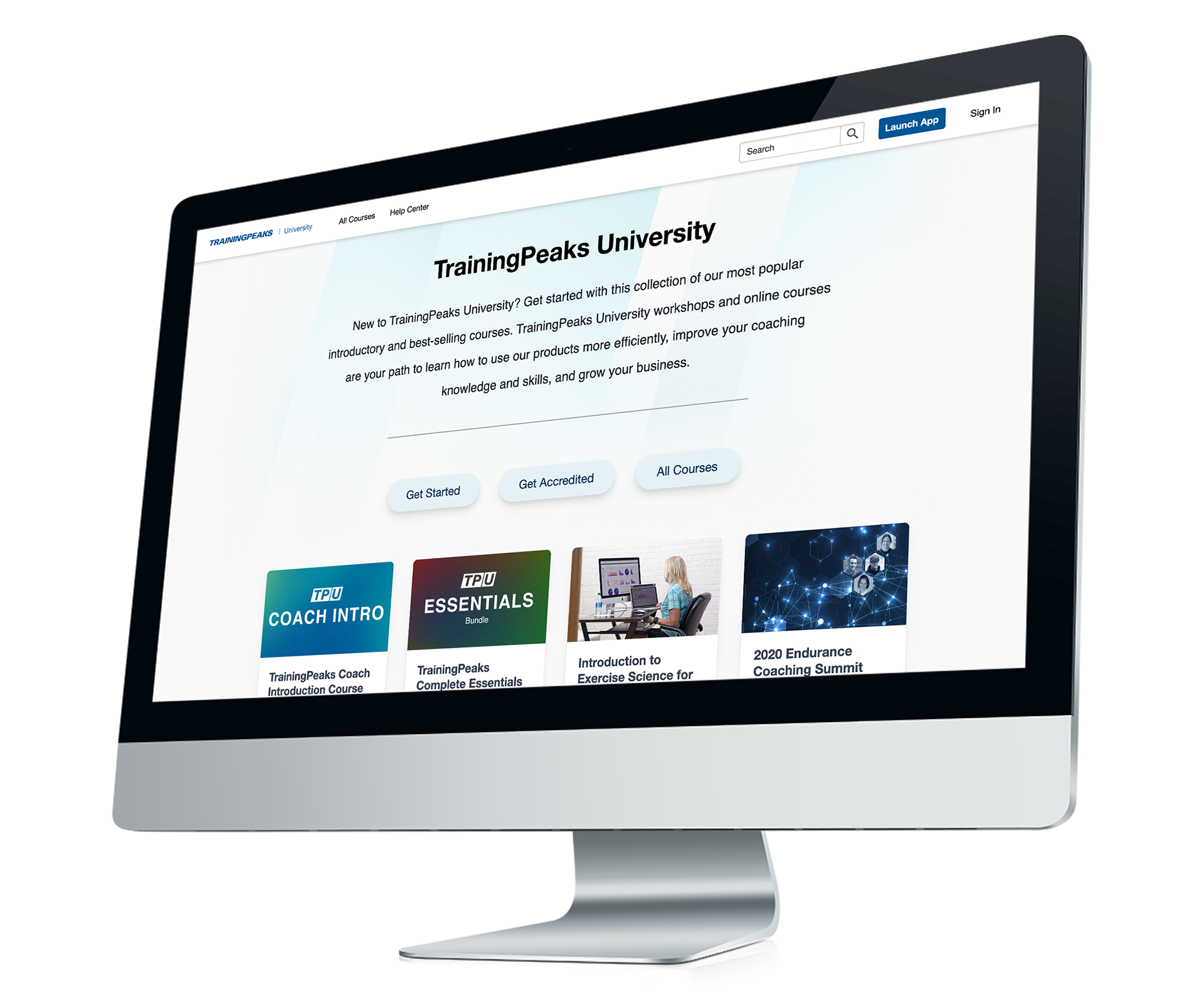
This project offered several interesting problems to solve. The navigation and sidebar proved to be tricky. We wanted to use the sidebar filters but did not want the sidebar itself present on the homepage. I designed the homepage to be a clean and simple presentation with options that led the user to our two main actions and also presented the "All Courses" button. This would provide the opportunity for the user to arrive at the filtering sidebar page without having it clutter up the main landing page. Due to the shifting nature of content managed by our education specialists, we needed the homepage to have a design that worked with anywhere from 2 - 7 filter chips responsively.
The site is designed to require as little maintenance from designers and engineers as possible after launch, lending to it's extreme minimalism and flexibility.
🚀 Course registrations have more than doubled month/month on average.
⬆️ New users rose 9% over 6 months.
💫 And... we have data! (automated 😉)
Where we had very little and mostly manual tracking and data before on the users' navigation and path through the site, we now have comprehensive tracking. This will enable more informed decision making for what elements are performing well and where our energy and focus should be on the site as we continue to build and improve the experience.
