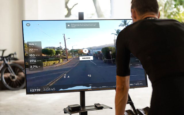
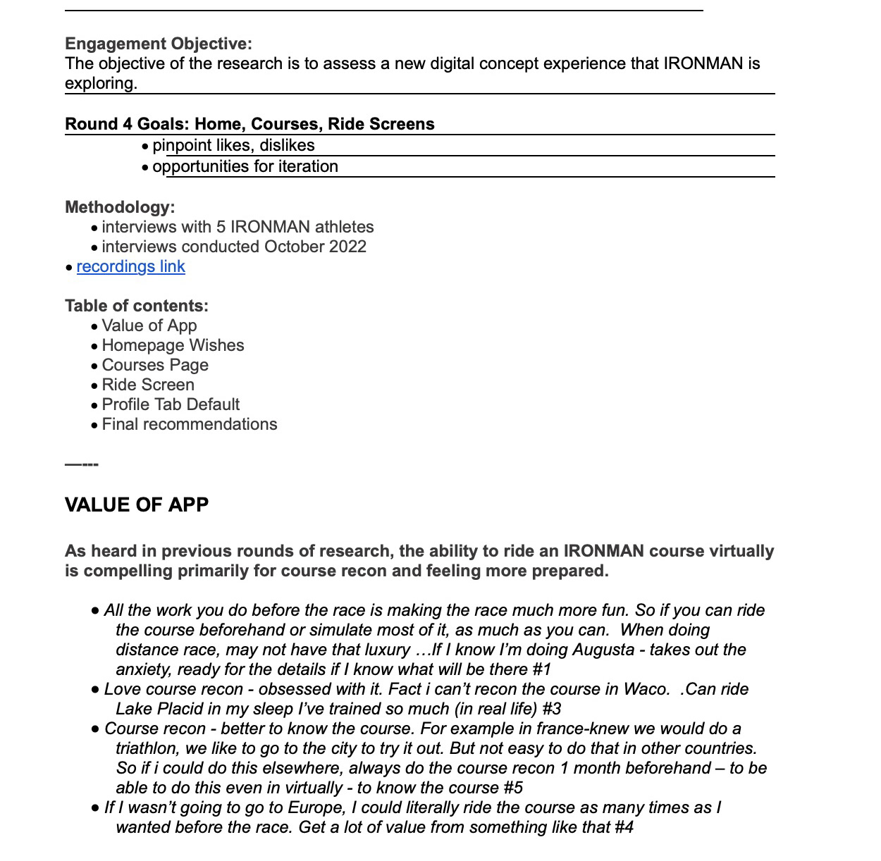
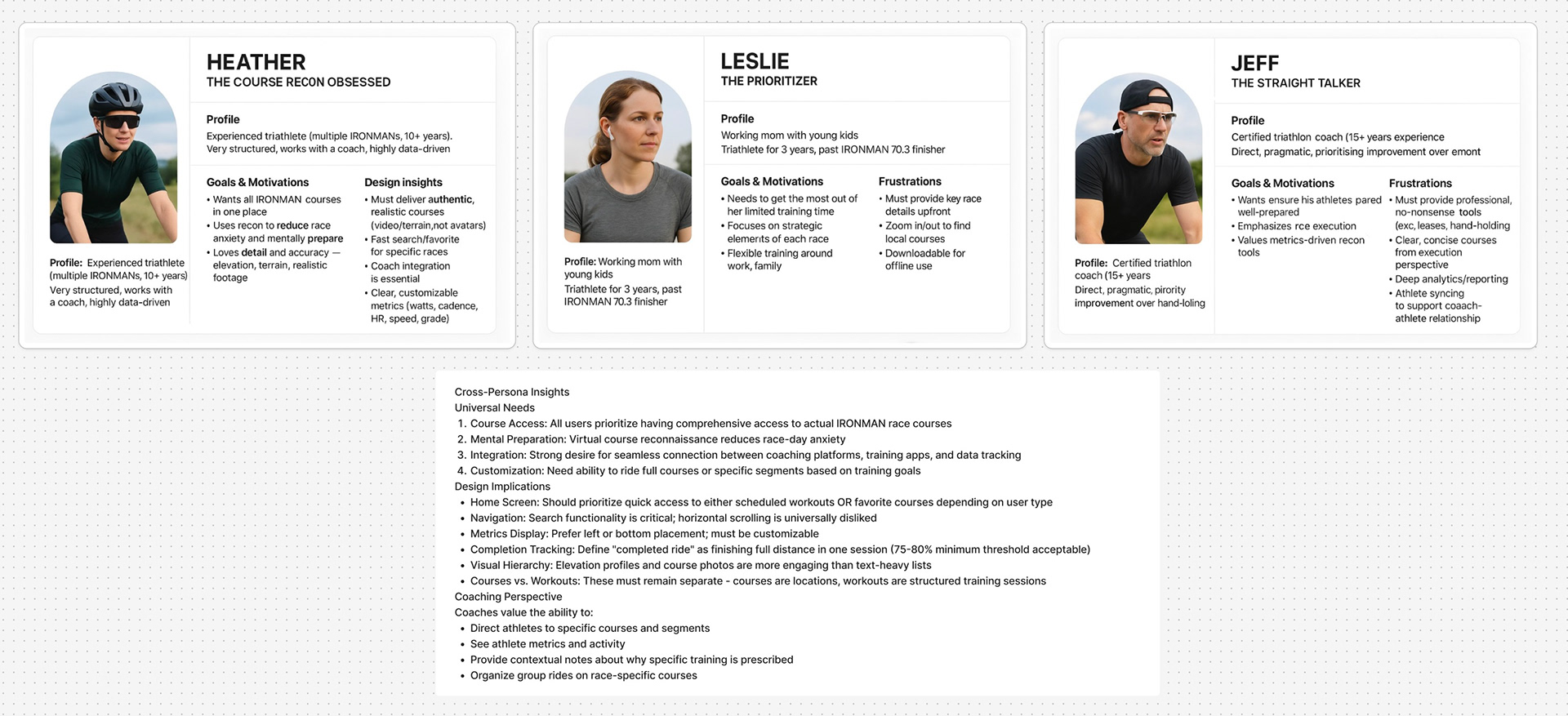
The beginning of our process interviewing users to begin building a deeper understanding of what these users wanted and needed out of a virtual training platform.
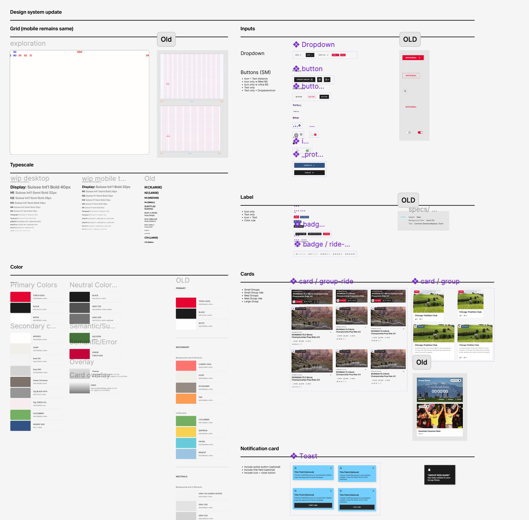
We added to a bare bones design system as we went, being as resourceful and lean as possible.
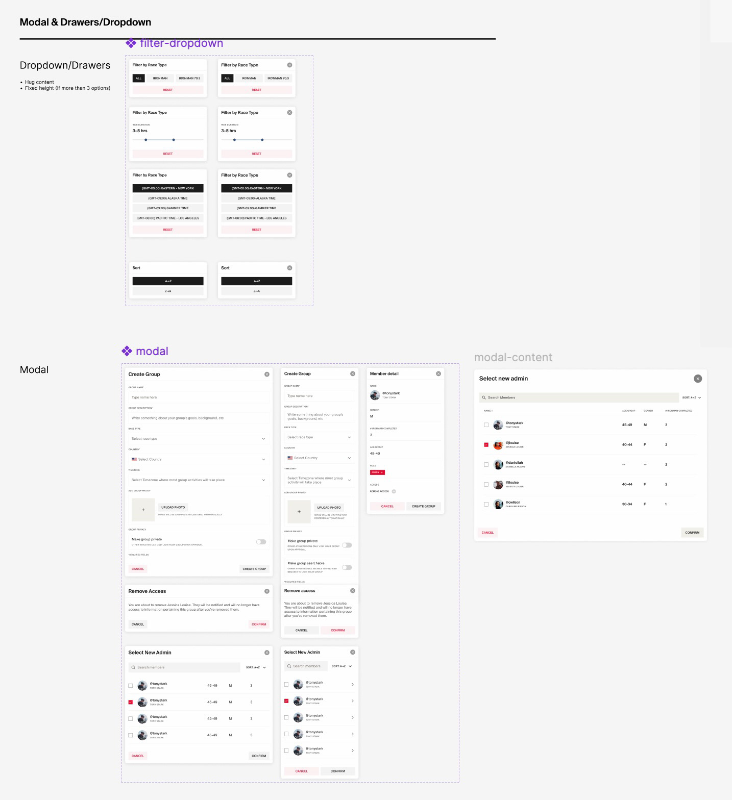
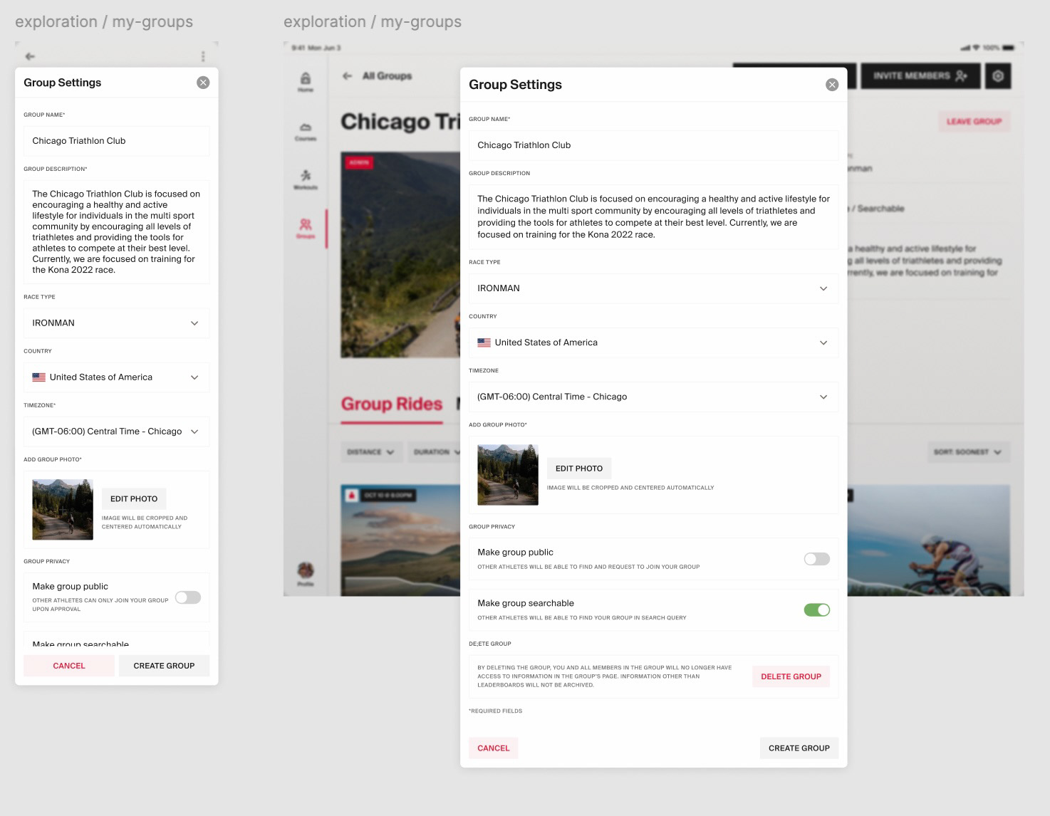
We leveraged components from the previous contracted firm's designs when applicable, and scrapped what didn't work.
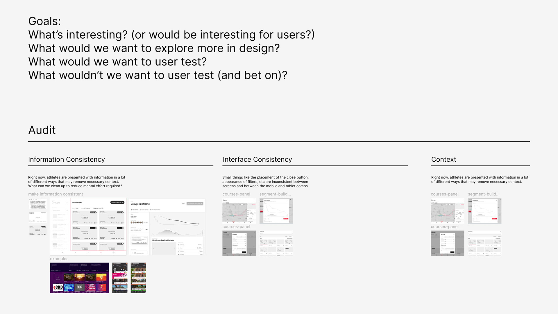
Our team needed to prioritize what we tested and which features to focus on because of tight time constraints.
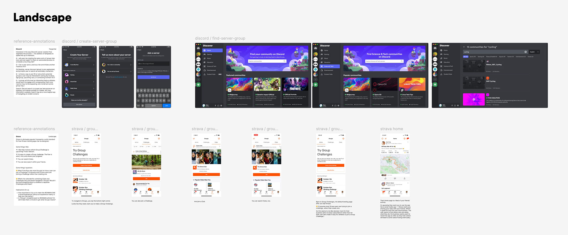
Our competitive analysis pulled from other players in the same industry and other players in the virtual reality realm.
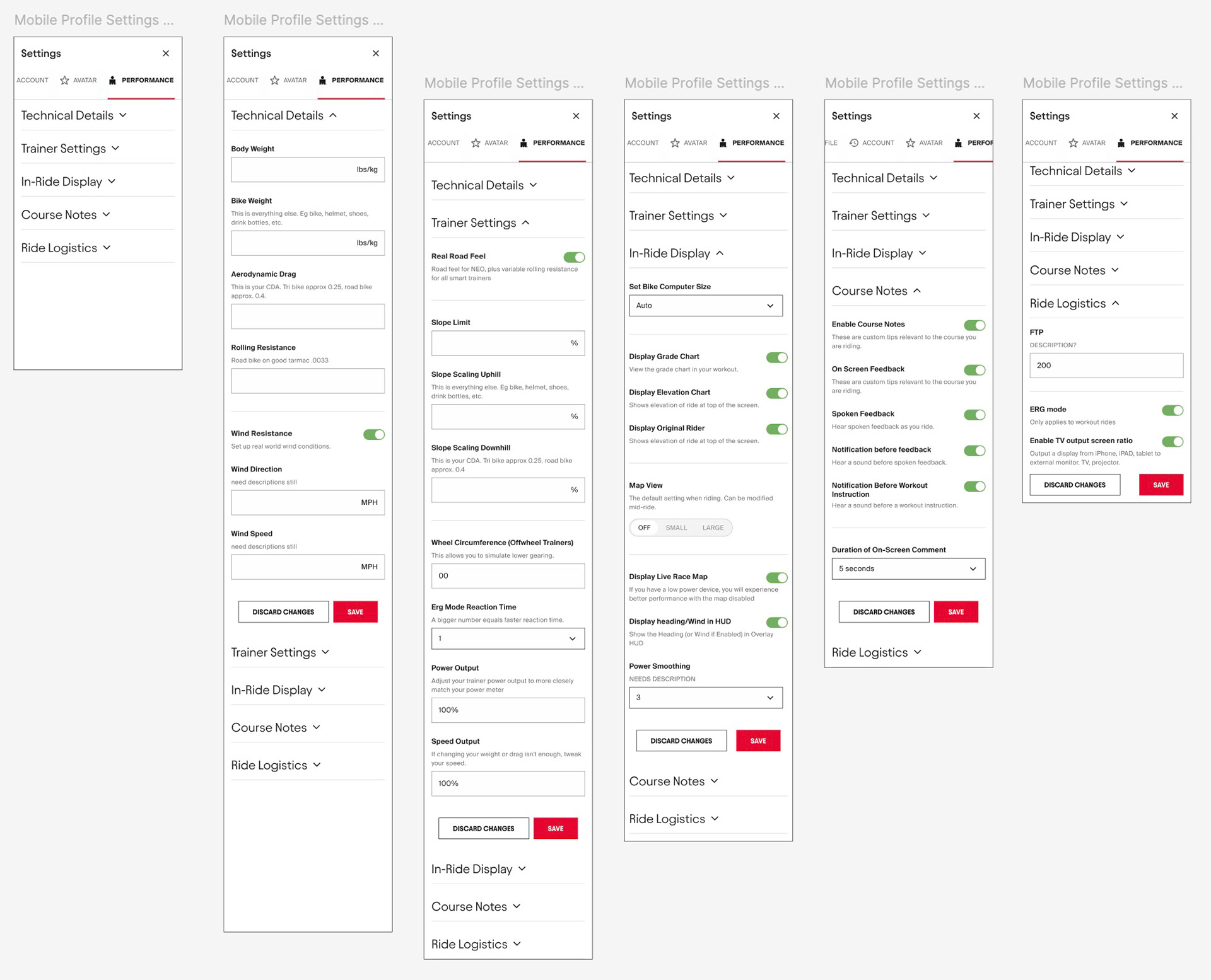
Engineering agreed that relying on native patterns for the less prioritized features (such as Settings) made sense to expedite getting things built while we tested and iterated on the higher value features.
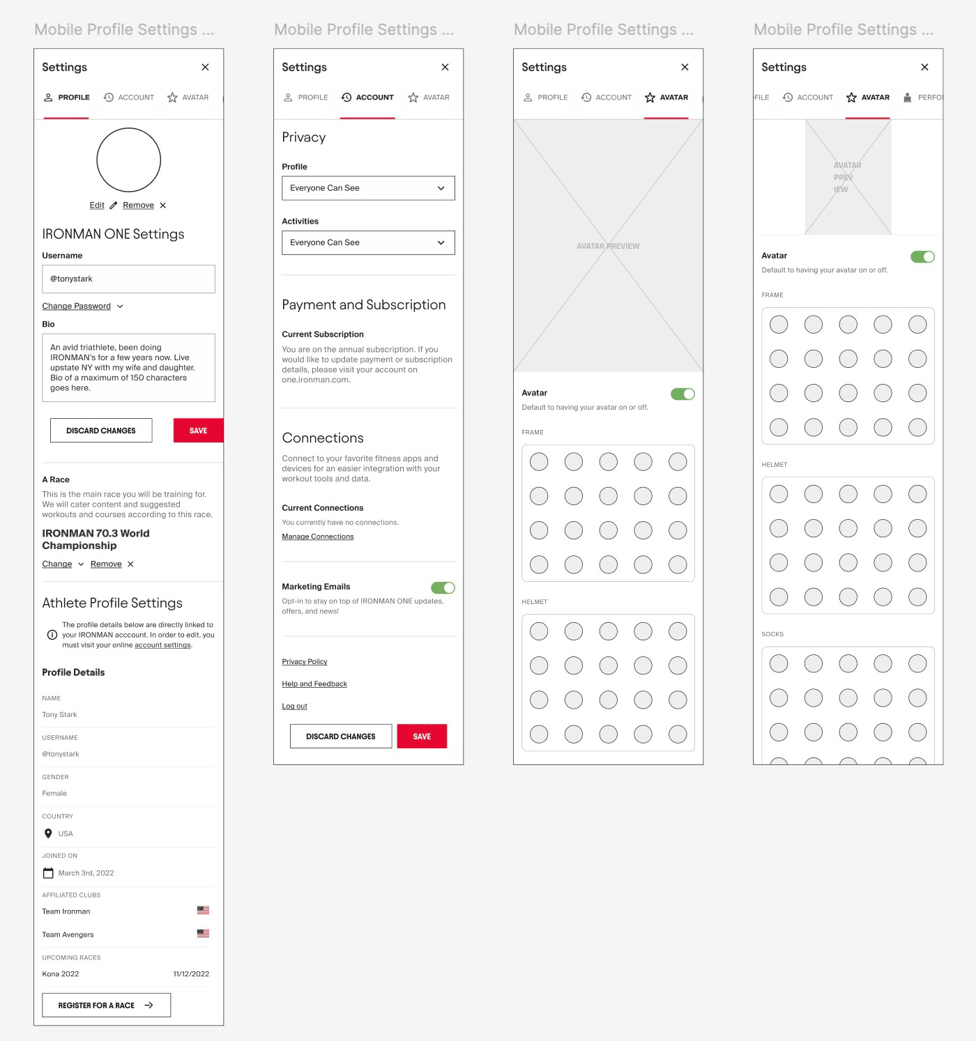
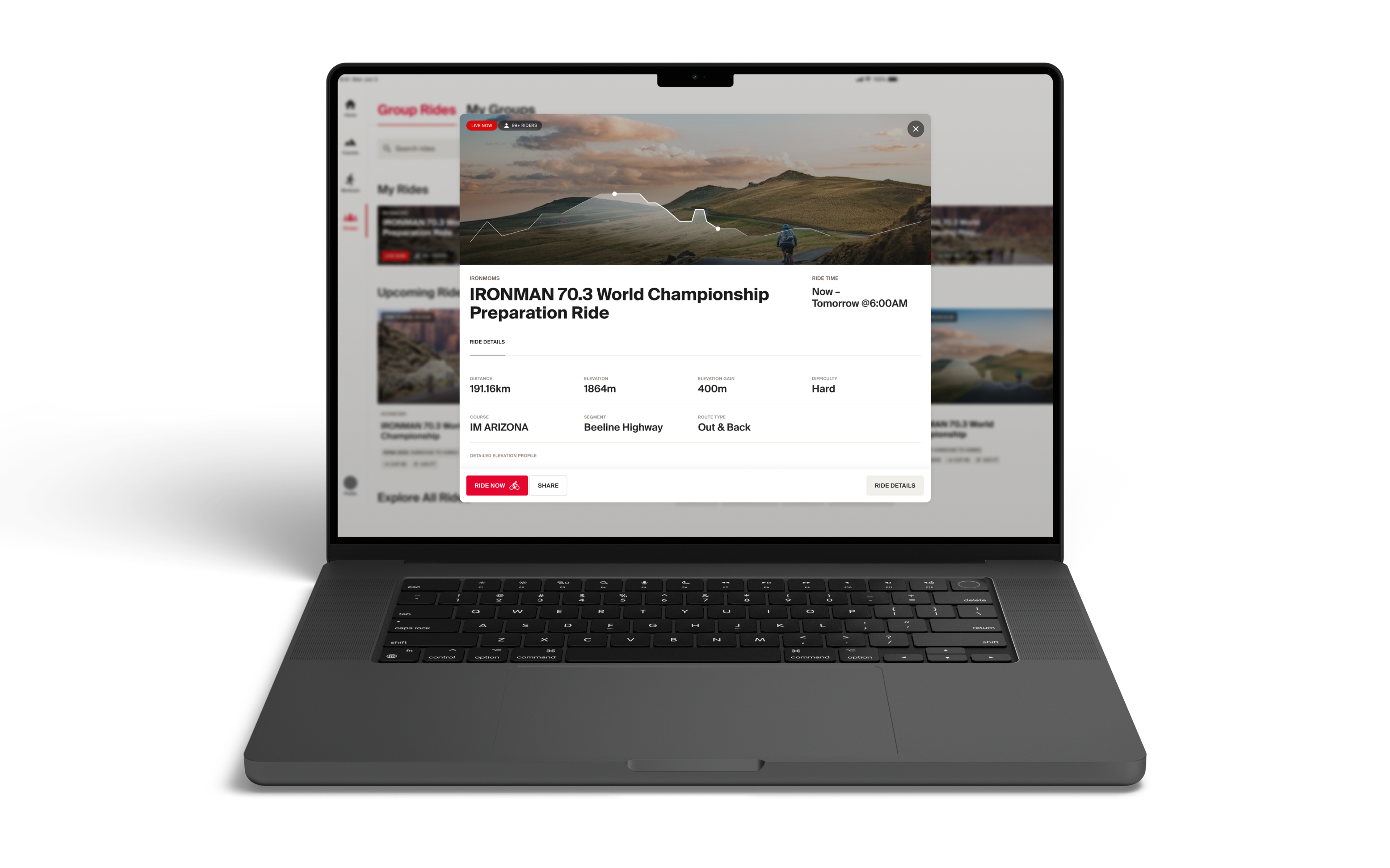
We relied on the acquired app's patterns that had proven successful and delightful for user from their data, like avatar styling.
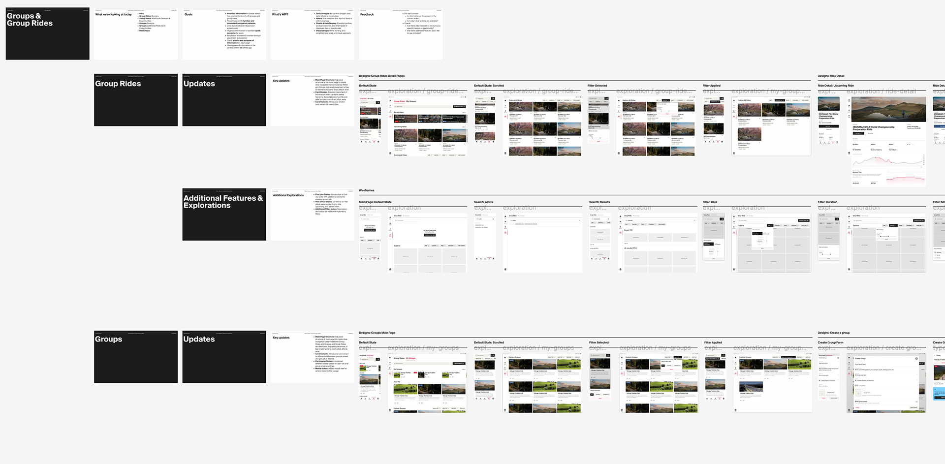
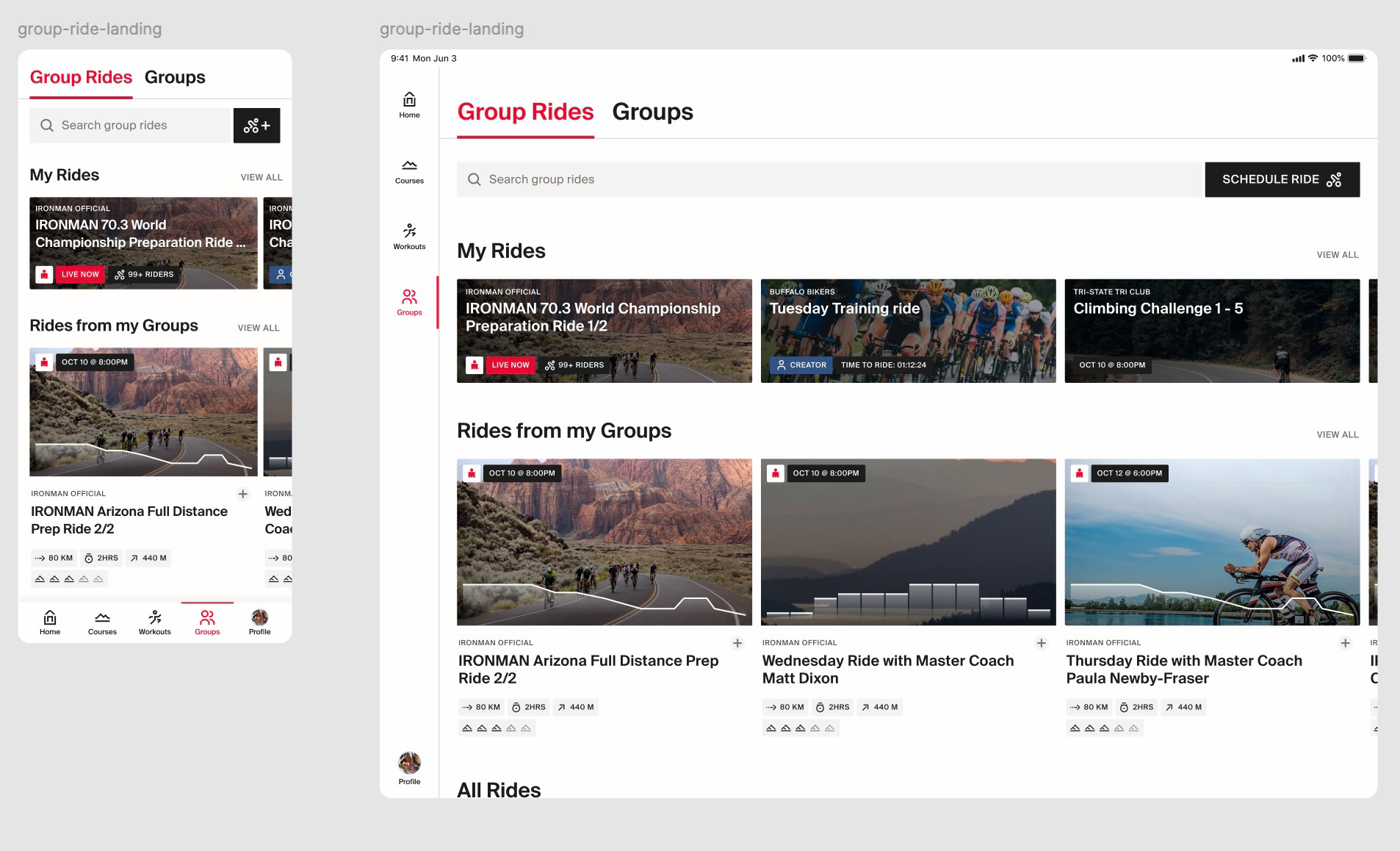
I managed a contract design team with limited meeting times, so our design reviews needed to be extremely pointed, productive, and specific. We came up with a Figma doc-based review documentation method which worked beautifully to capture feedback from stakeholders and other team members.